BACKGROUND
Meet D Experts is a platform that democratizes access to learning by pairing new entrants in various fields with proven veterans that are eager to nurture them . The challenge in the MDE contest was to Design a Mobile web view of the MDE desktop view on the figma community to enhance the user experience for customers accessing the platform on their mobile devices.
PROBLEM STATEMENT
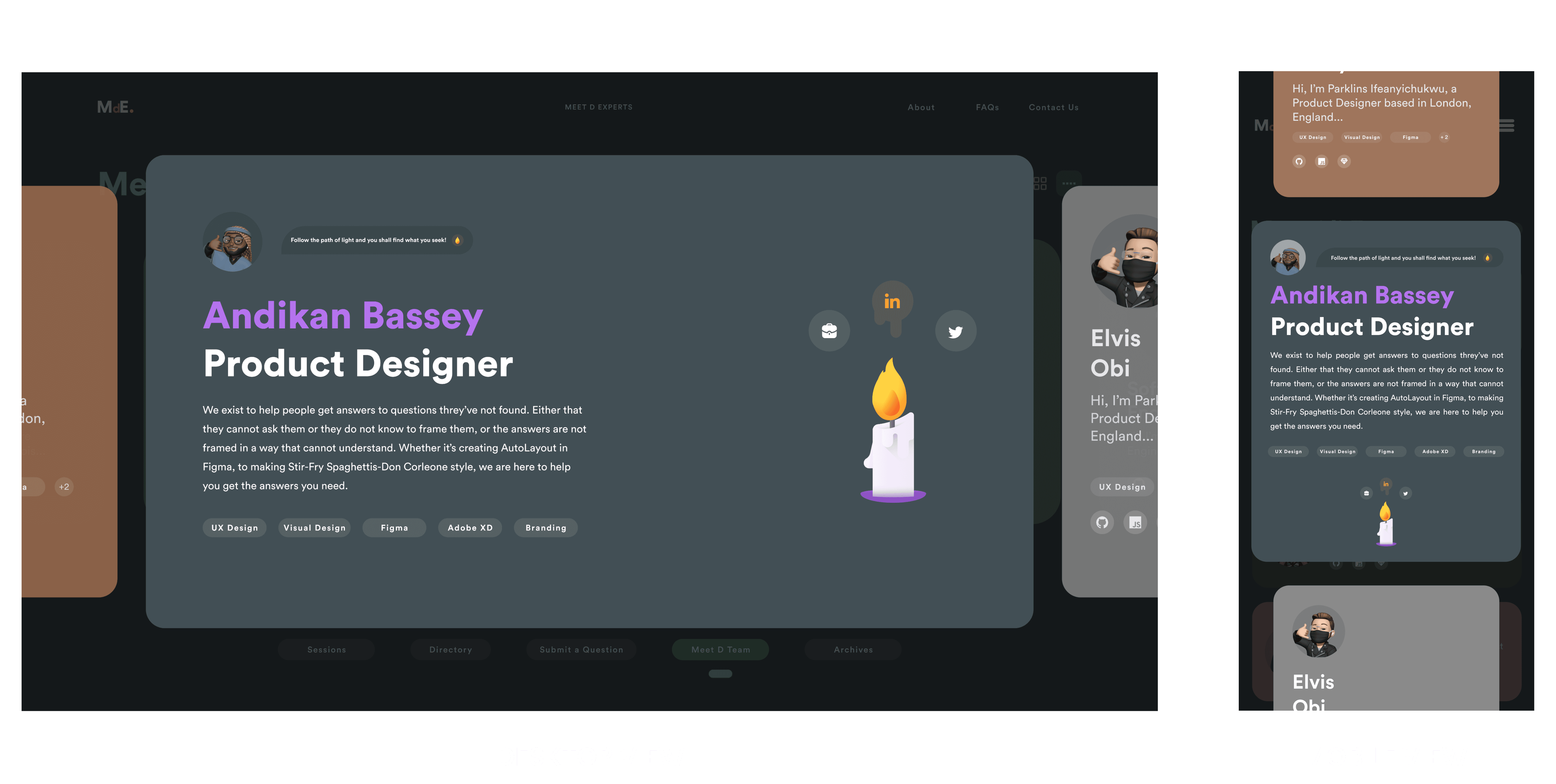
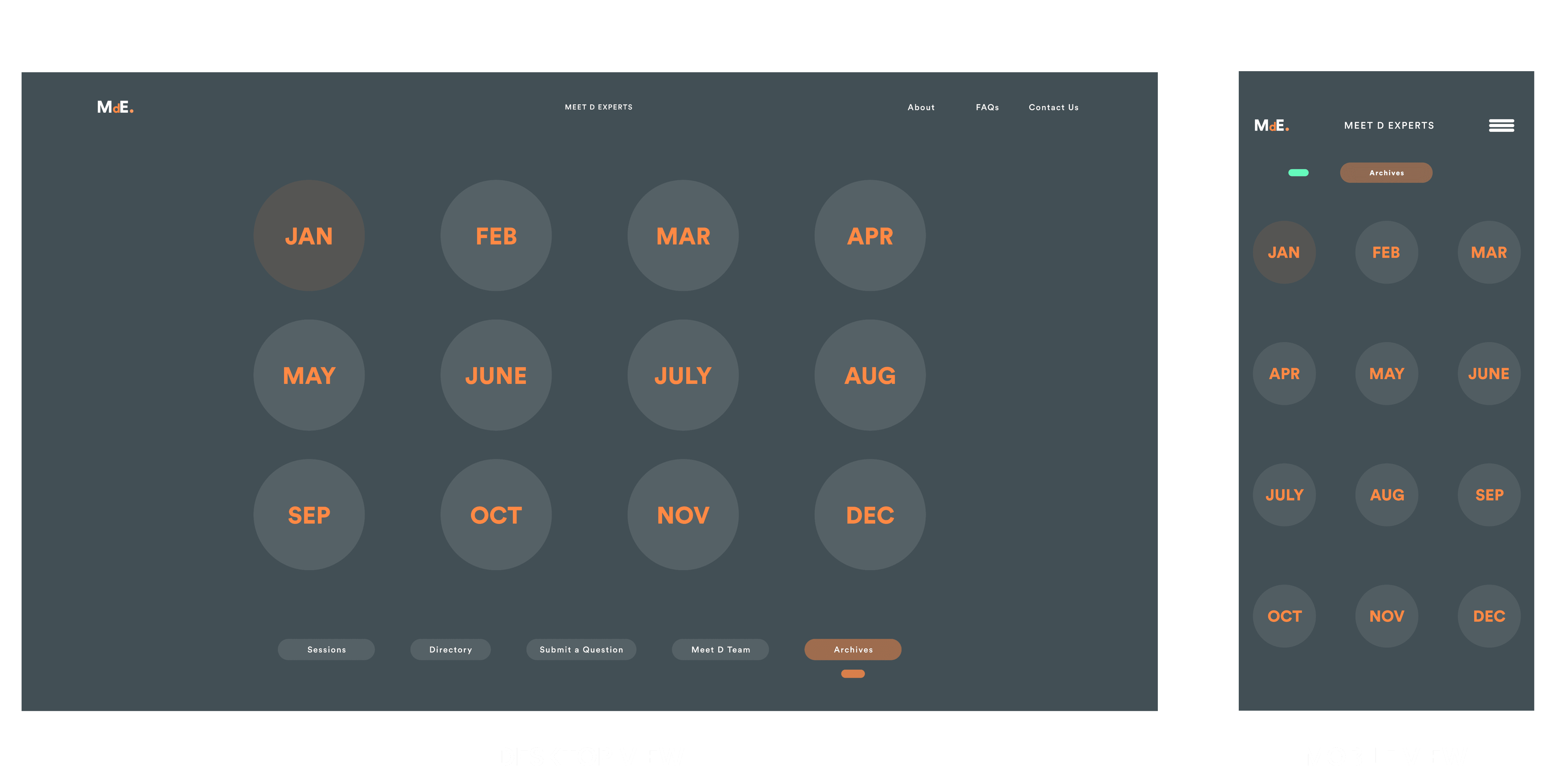
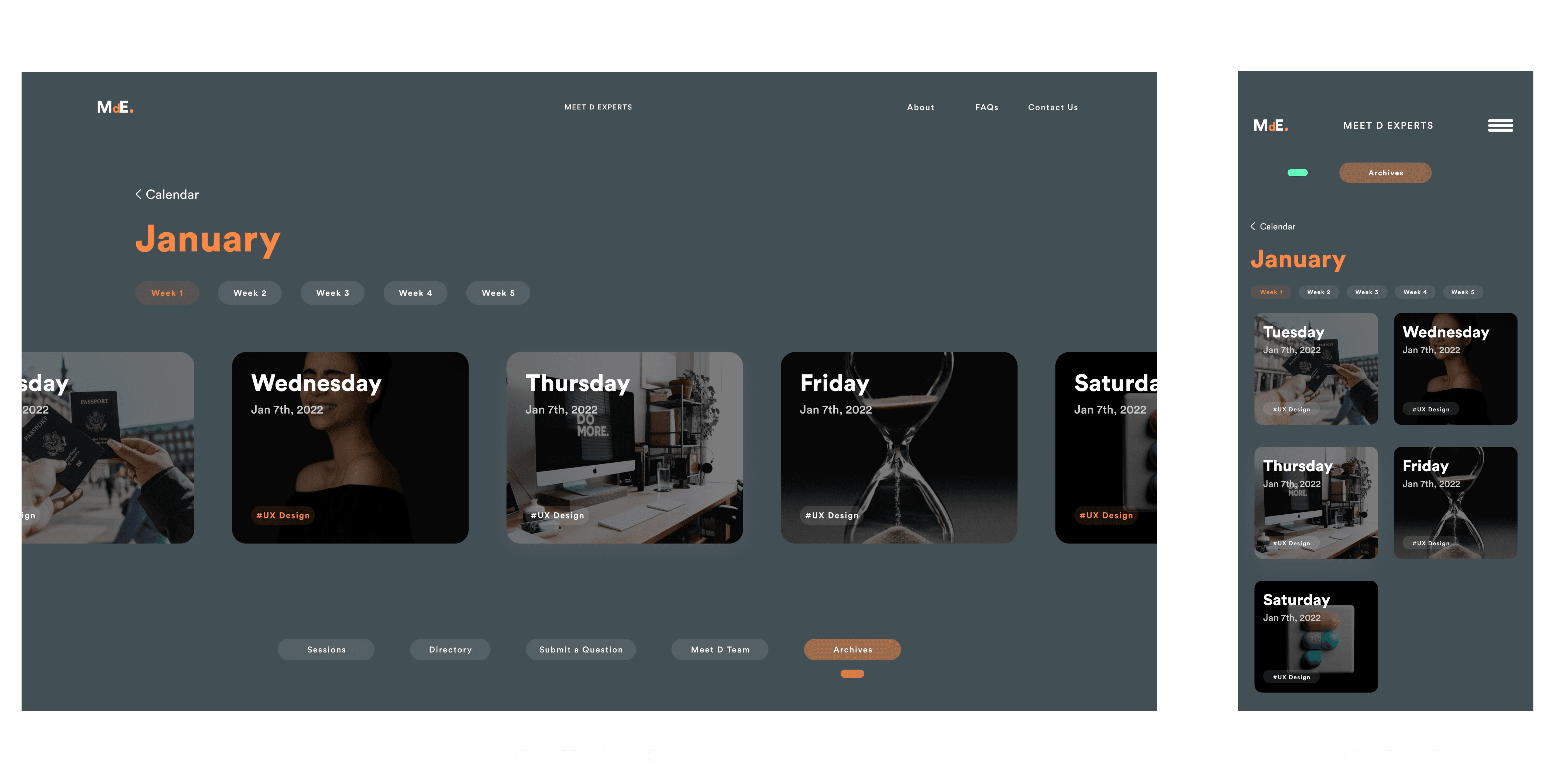
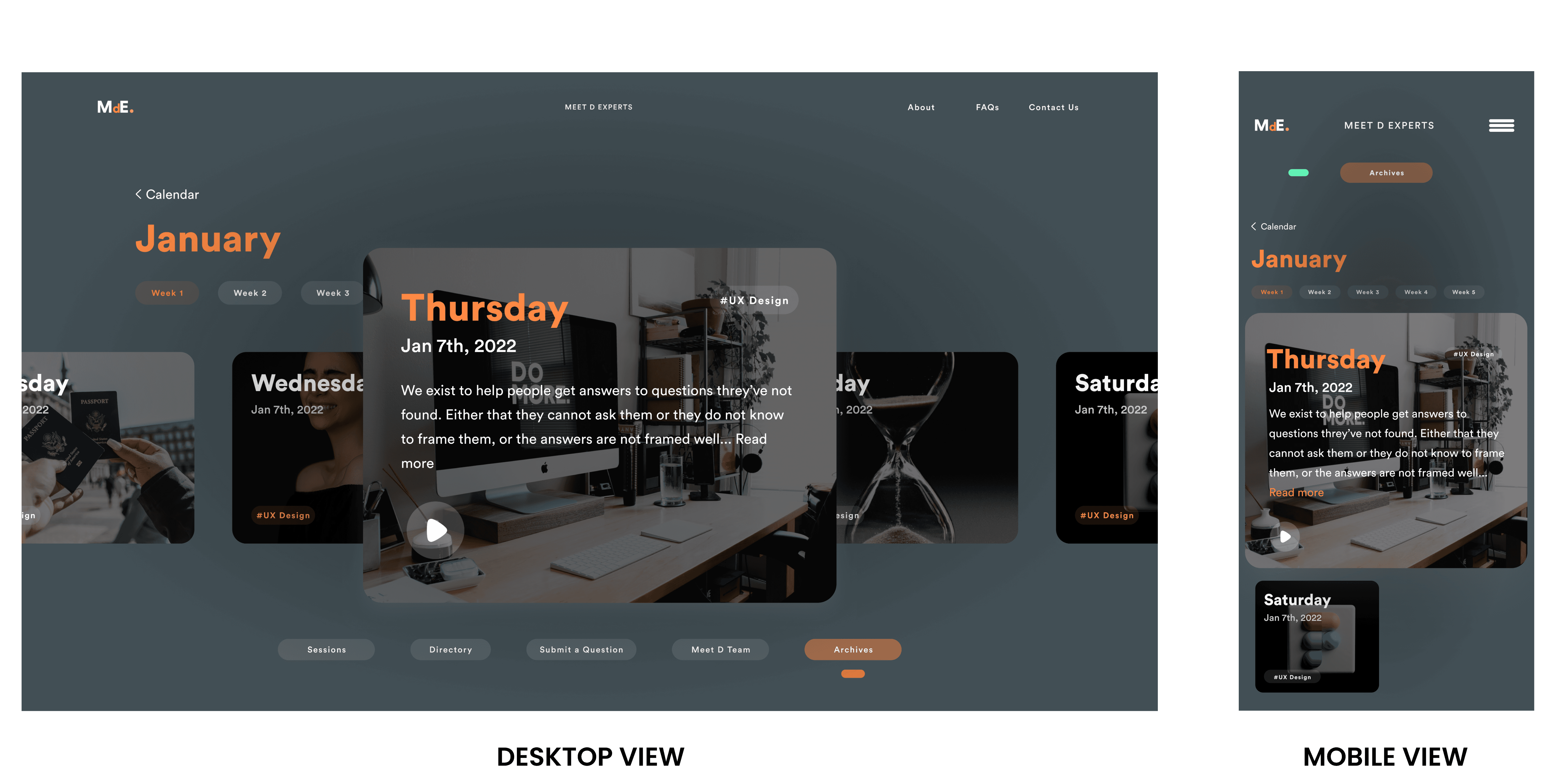
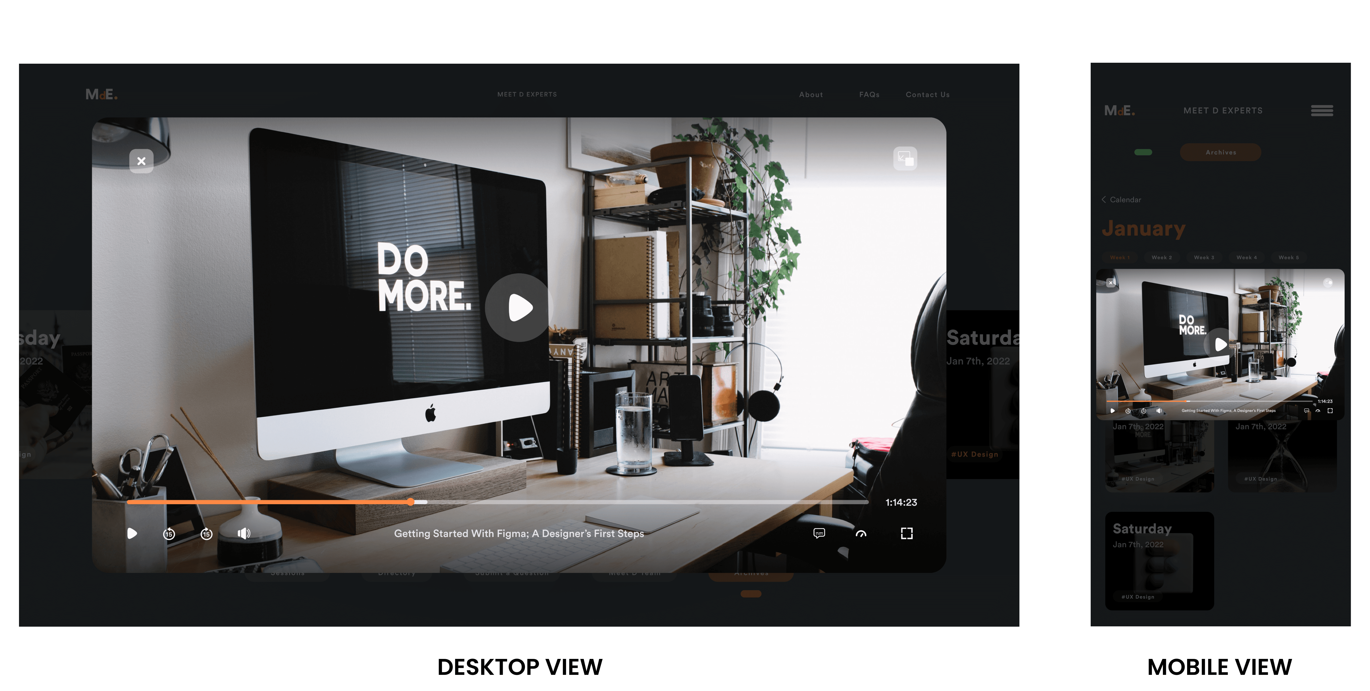
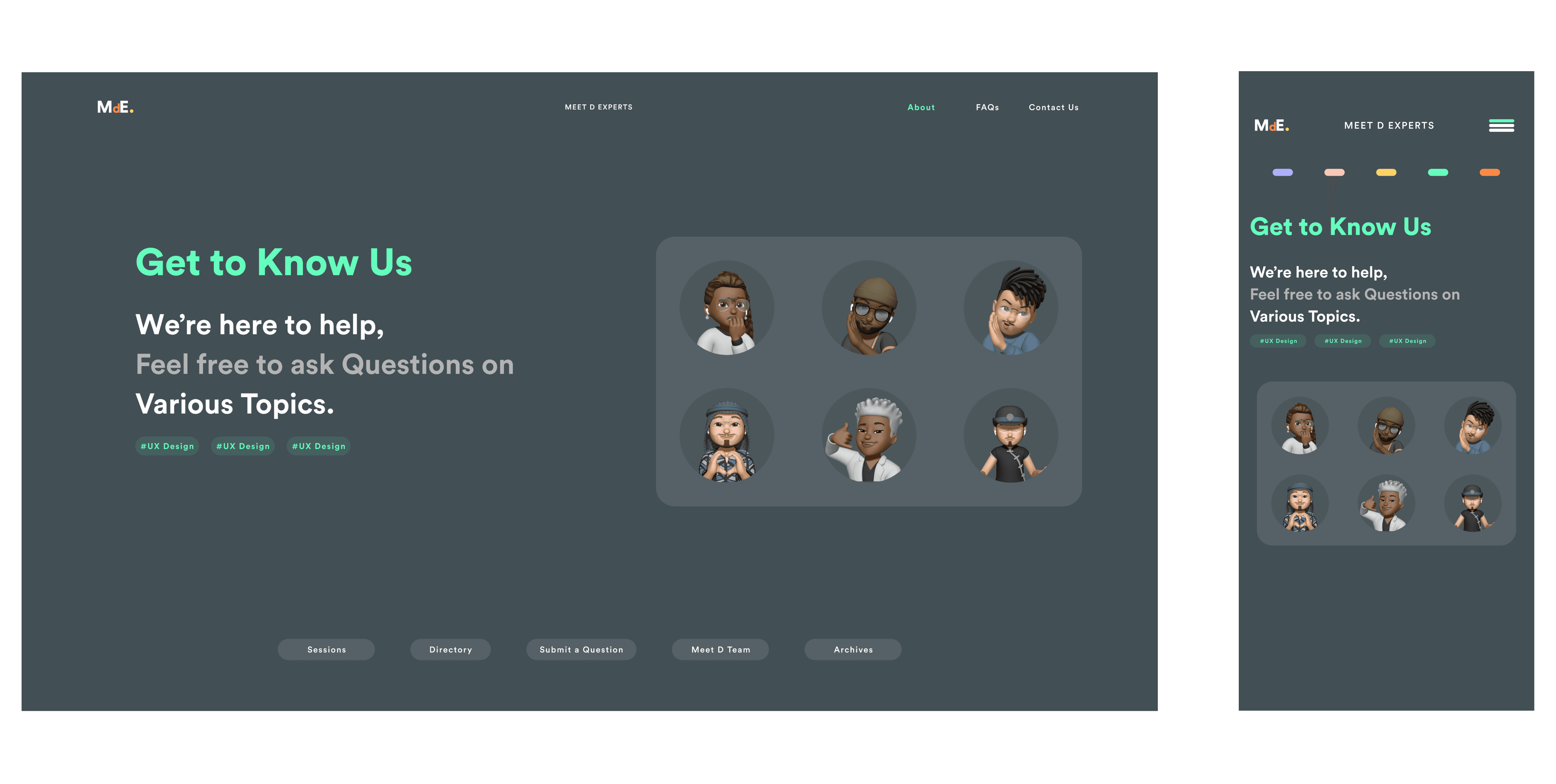
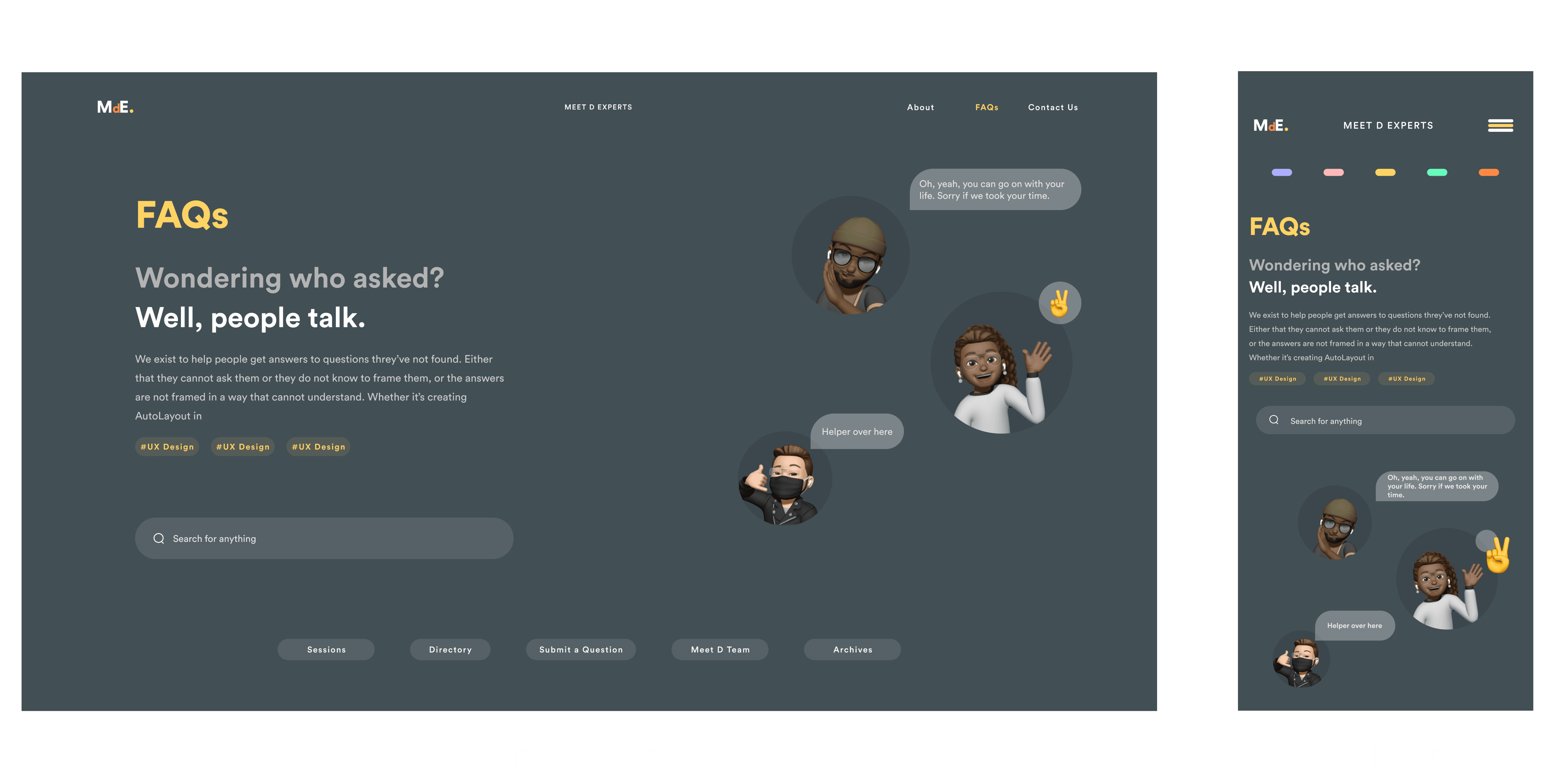
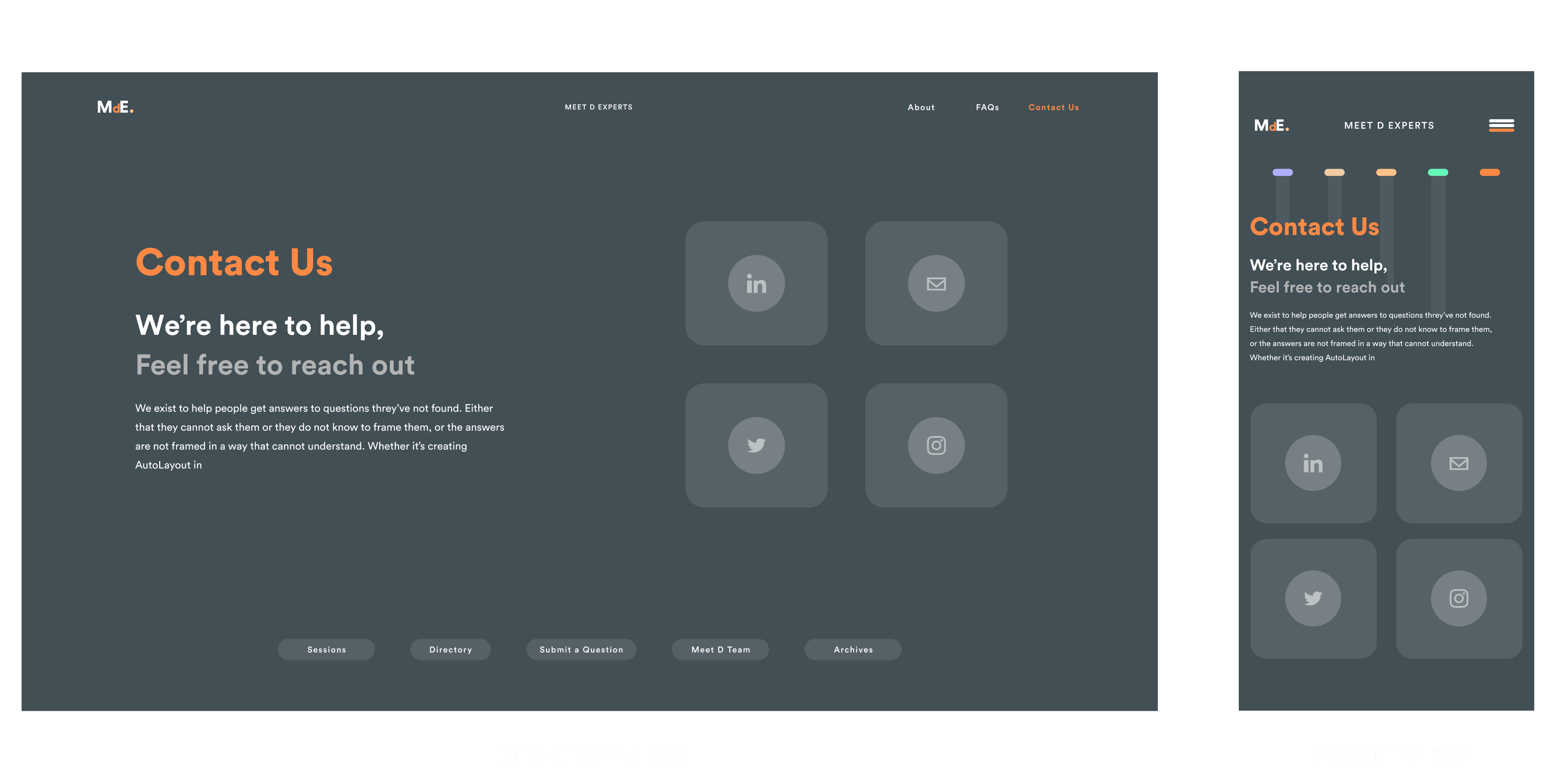
The MDE desktop view was designed for larger screens and was not optimized for mobile devices. This made it difficult for customers to navigate and use the platform on the go, which resulted in a subpar user experience and decreased customer engagement.
RESEARCH METHODS
Analyzed the existing Bontii desktop view, including its layout, typography, color palette, and other design elements
Identifed key elements that needed to be adapted for mobile screens based on the research findings.
ANALYSIS
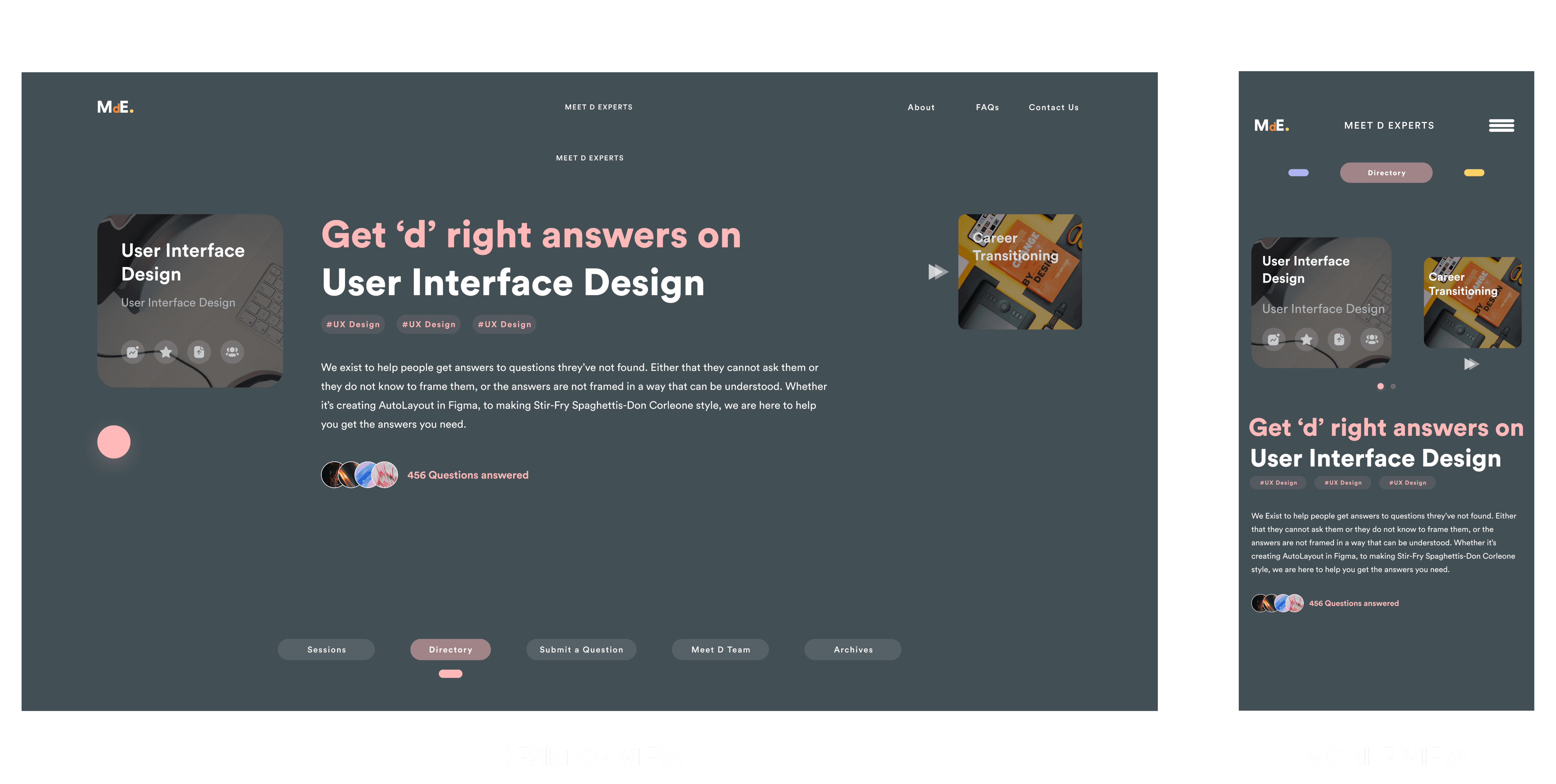
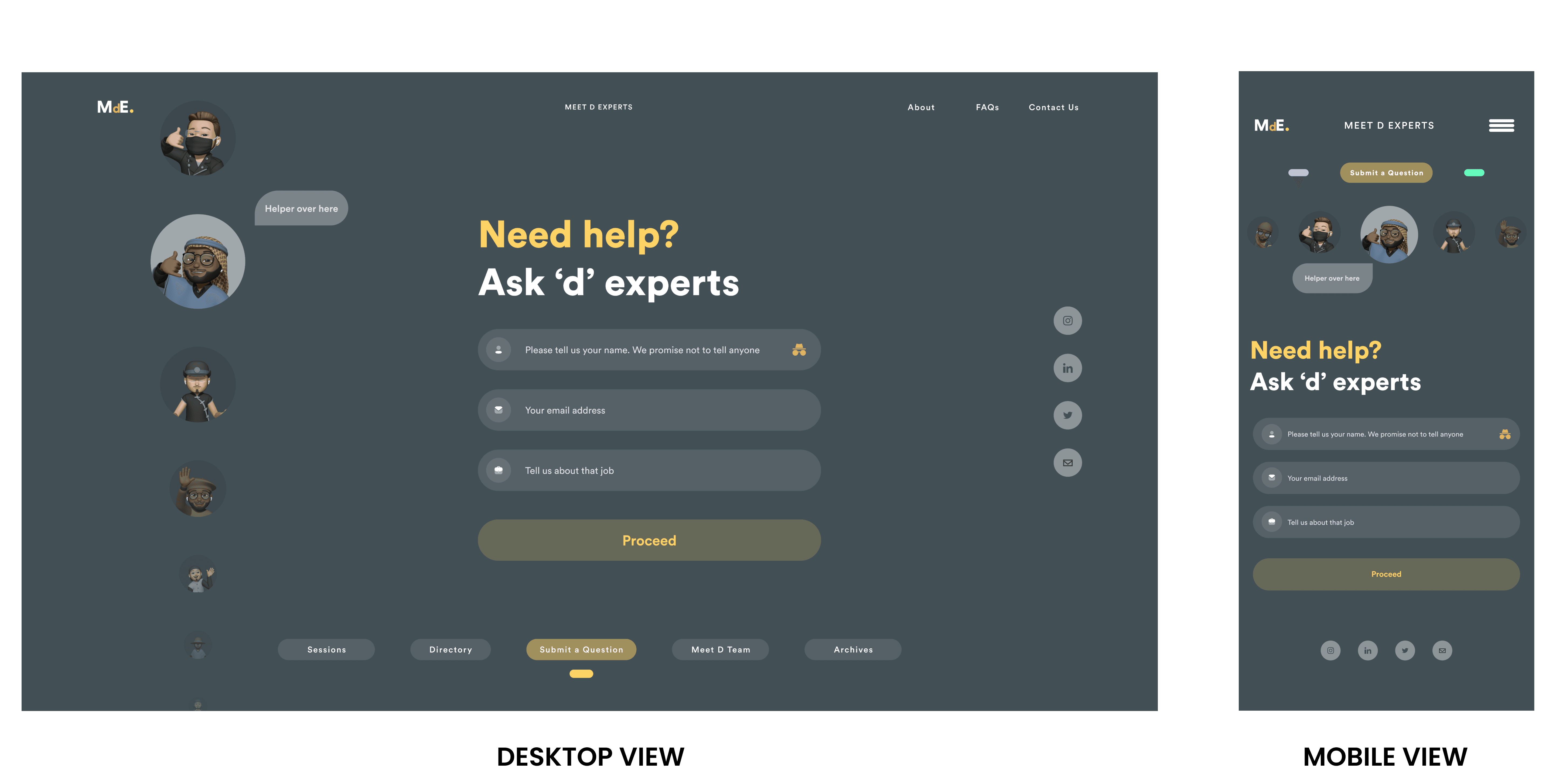
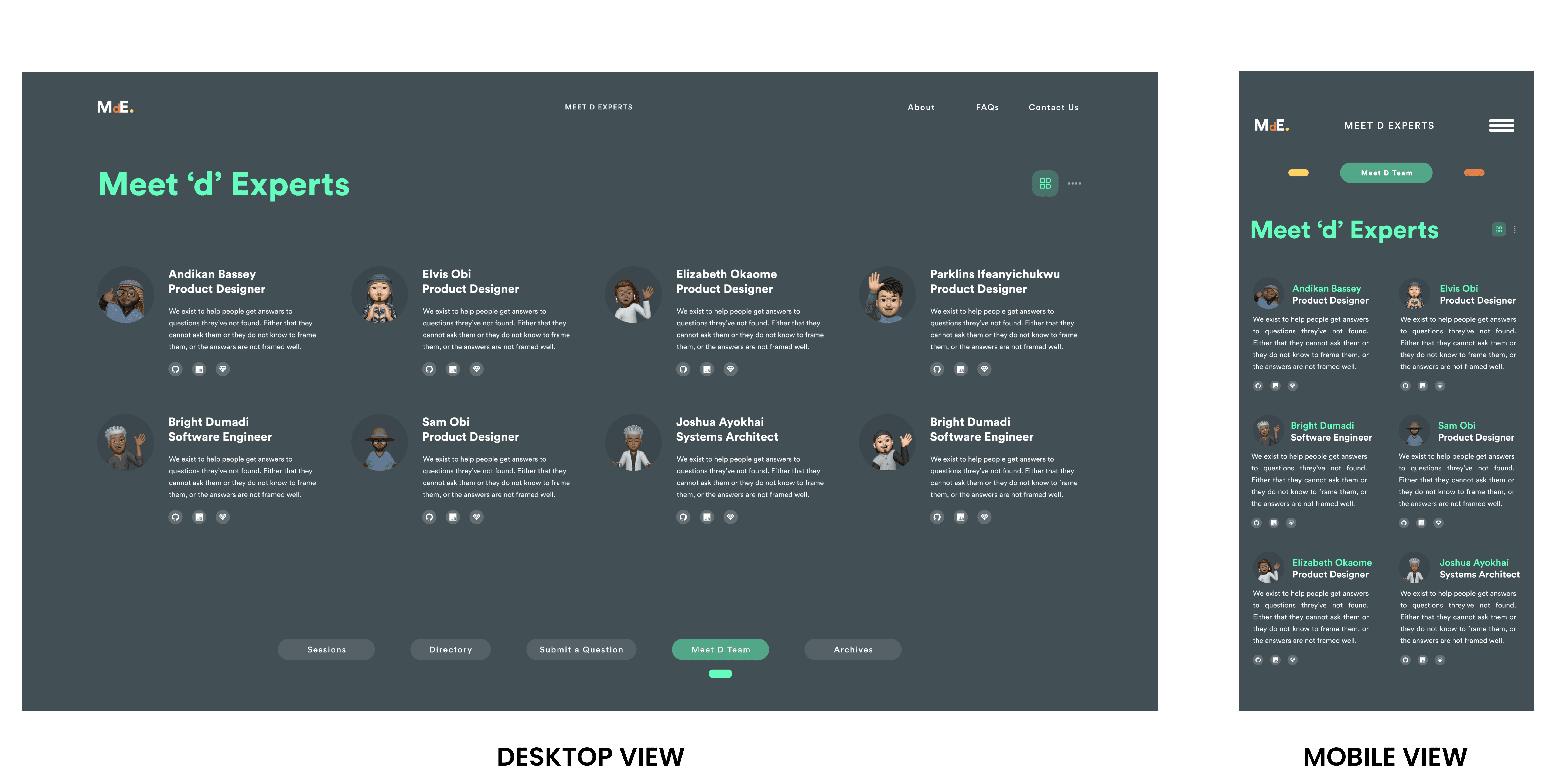
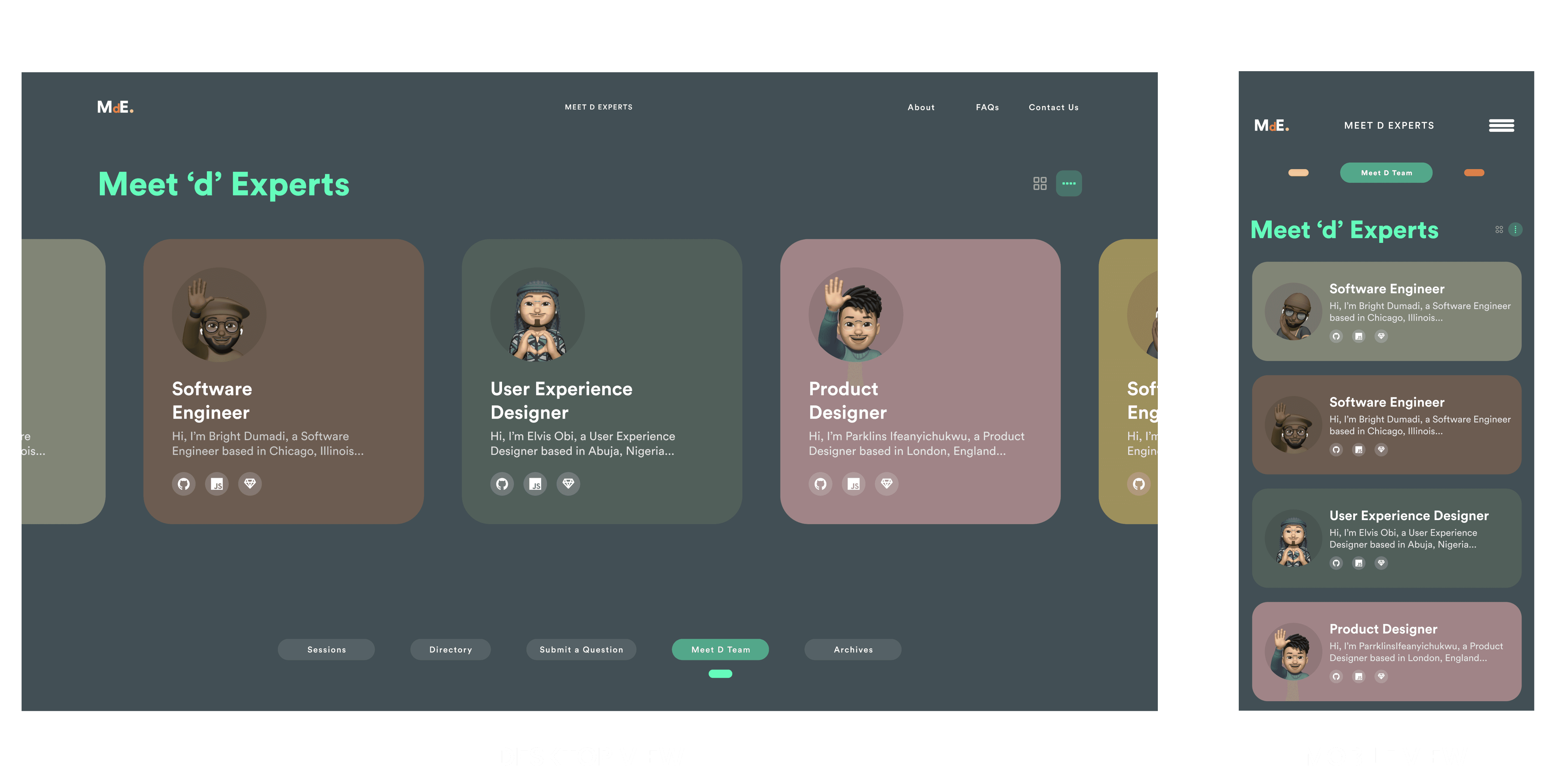
The existing MDE desktop view had a complex layout with multiple sections and columns, which made it difficult to navigate on smaller mobile screens. The typography was also small, making it difficult to read the text on mobile devices.
IDEATION
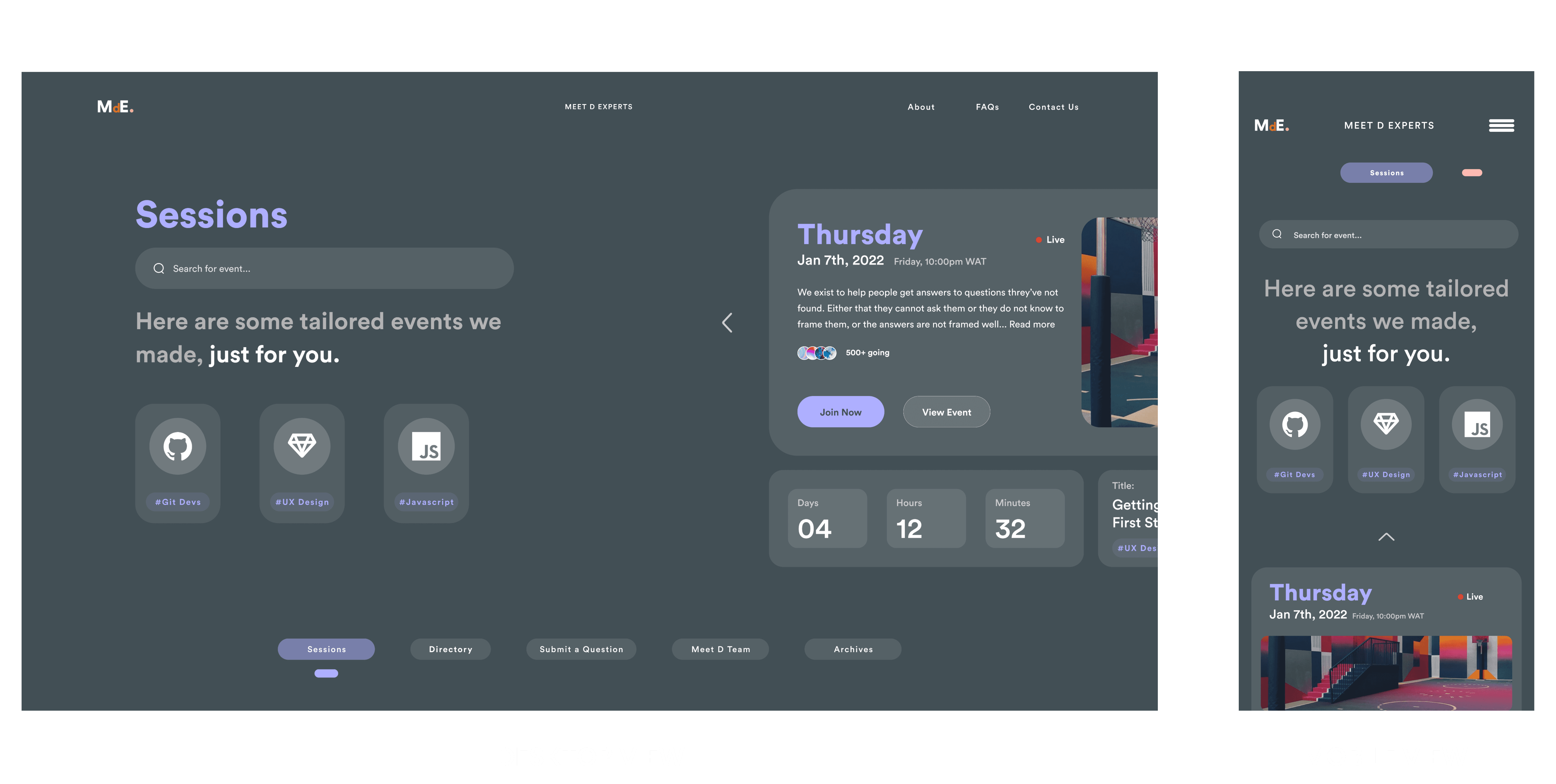
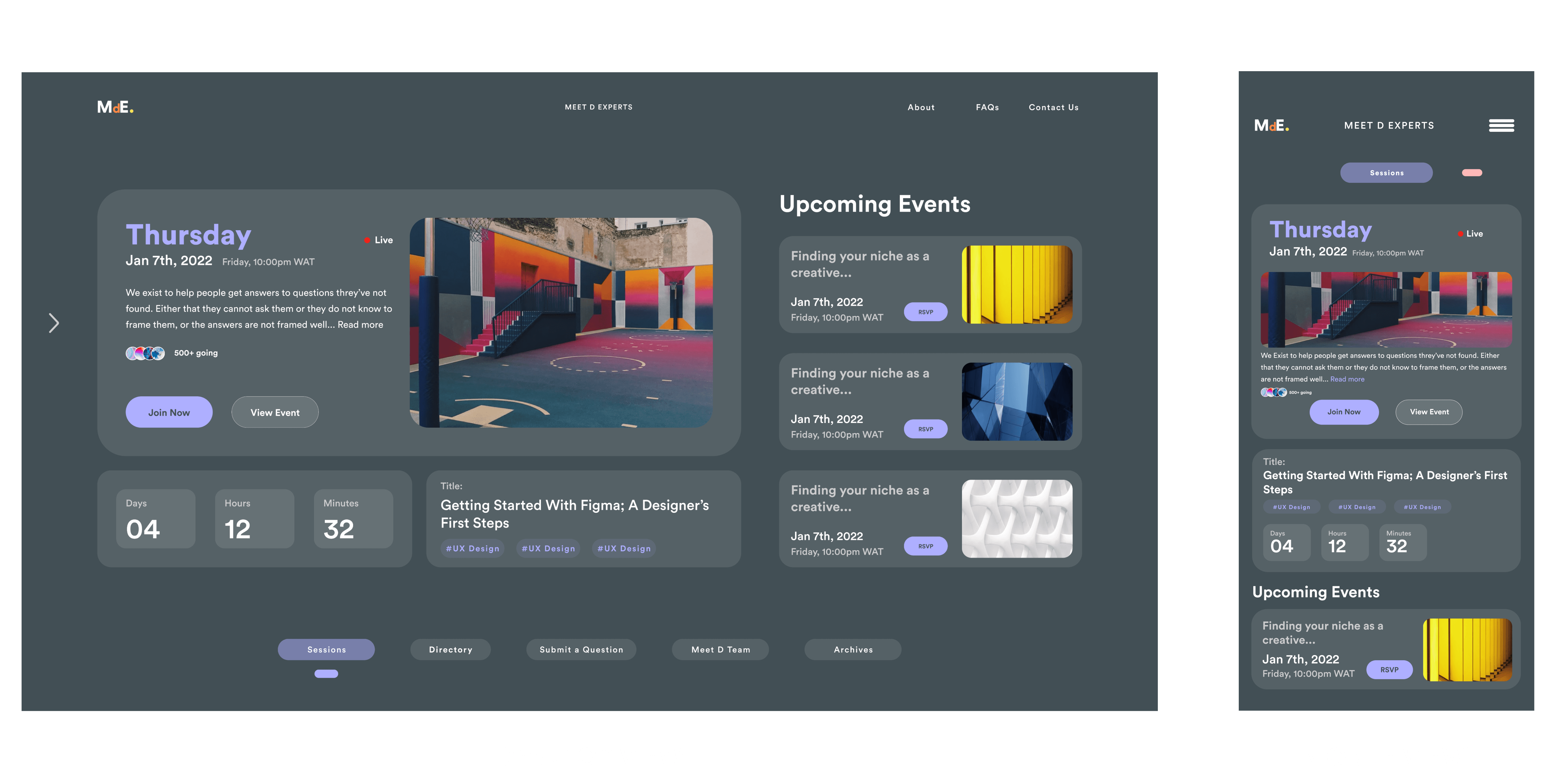
I came up with several ideas and concepts during the ideation phase, including streamlining the layout, using larger typography, and optimizing the color palette for mobile screens. I arrived at my final design solution after conducting user testing and receiving feedback
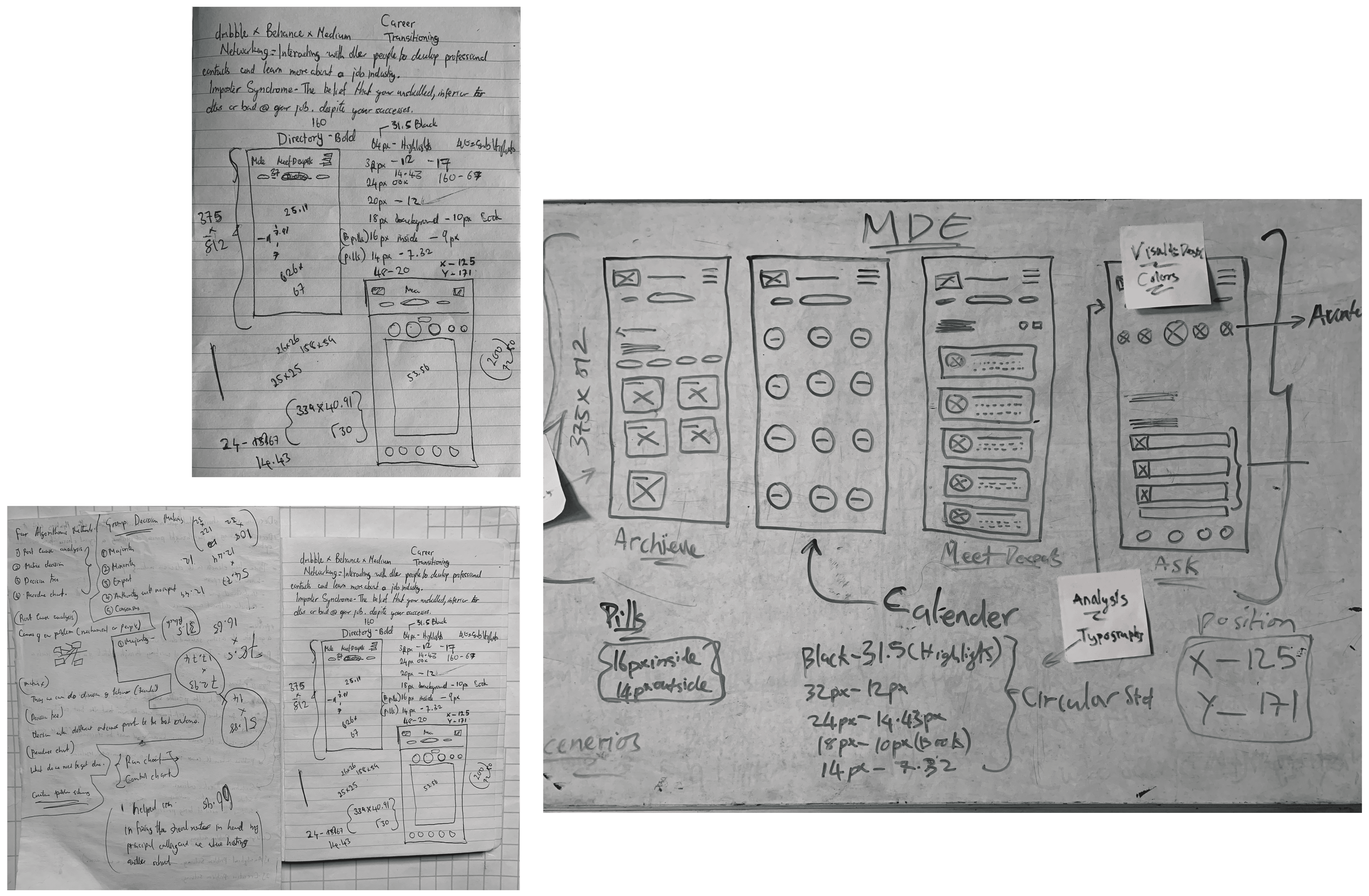
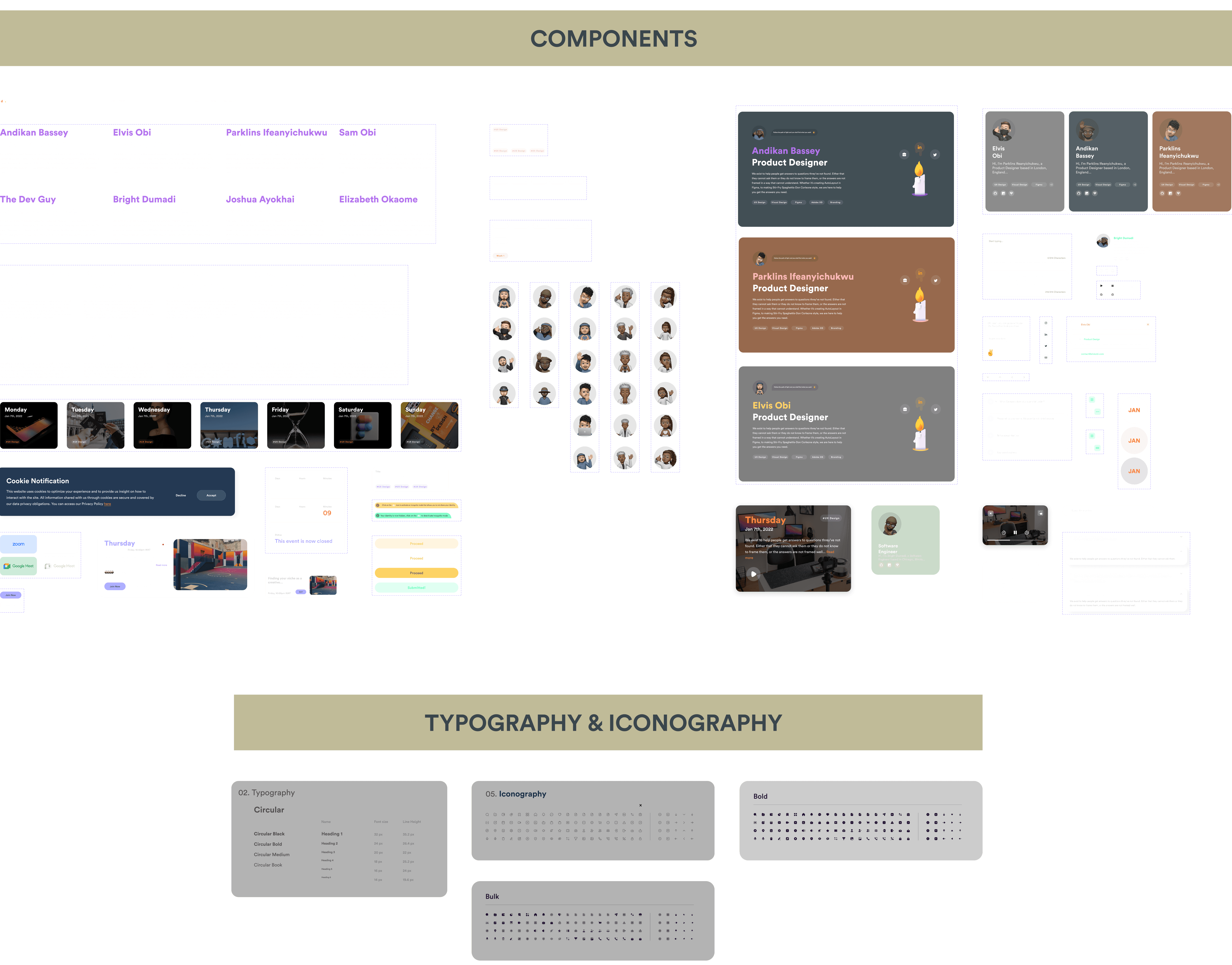
DESIGN PROCESS
I sketched out paper wireframes of my design. I focused on creating a clean, simple layout with large typography and an optimized color palette(already given) that was easy on the eyes. I also ensured that the navigation was intuitive and easy to use on mobile devices.